
This content as well as whole blog is dedicated to Xamarin/.NET related topics but this particular post can be found useful for Java or Kotlin developer since it's mainly xmls
tl dr; give me repo? Here you go 🤗
 jeremi-przeorek
Introduction
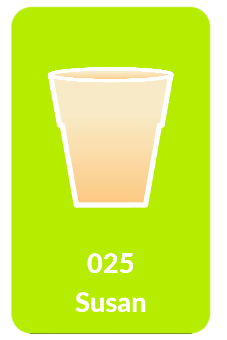
Recently while working on my startup's Android TV app we needed to inform users about progress on theirs drinks. With the team we came to conclusion that in central part of the screen we'll display vertical progress bar that will imitate filling of cup with some flawless animations. This is how I did that!
0. What we'll do?
1. How we'll do it?
Roots
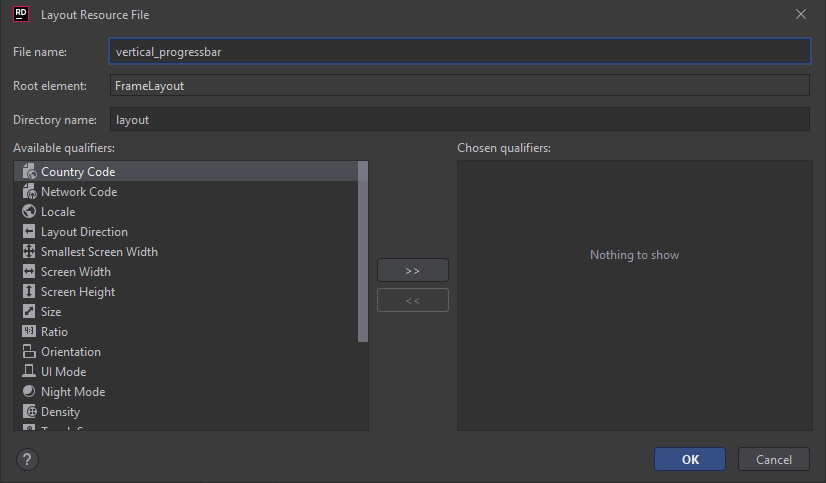
In situations like these I like to extract layout to separated xml file. Let's create new Layout using Resource Manager. I'm using Intelij Rider.
Fillup the view
In my scenario I've got 3 major elements in this UI:
- Progress bar - in screen below it's green background
- Drink icon
- Drink description
I won't focus on 2 and 3 thus these are simple controls.
We'll call it Main Layout
Main layout code
<?xml version="1.0" encoding="utf-8"?>
<FrameLayout
        xmlns:android="http://schemas.android.com/apk/res/android"
        xmlns:tools="http://schemas.android.com/tools"
        android:layout_width="400px"
        android:layout_height="655px">

    <RelativeLayout
            android:layout_width="match_parent"
            android:layout_height="match_parent"
            android:orientation="vertical">

        <ProgressBar
                android:id="@+id/progressbar_current_order"
                style="@android:style/Widget.ProgressBar.Horizontal"
                android:layout_width="match_parent"
                android:progress="0"
                android:max="100"
                android:layout_height="match_parent"
                android:progressDrawable="@drawable/shape_current_drink_card"/>

        <ImageView
                android:layout_centerHorizontal="true"
                android:id="@+id/imageview_current_drink_card_image"
                android:layout_width="254px"
                android:layout_height="283px"
                android:layout_marginTop="120px"/>

        <TextView
                android:id="@+id/textview_current_order_number"
                android:layout_centerHorizontal="true"
                android:layout_below="@id/imageview_current_drink_card_image"
                android:layout_width="wrap_content"
                tools:text="321"
                android:layout_height="wrap_content"
                android:fontFamily="@font/lato_heavy"
                android:layout_marginTop="70px"
                android:textStyle="bold"
                android:textColor="@color/robbie_white"
                android:layout_gravity="center"
                android:textSize="55px"/>

        <TextView
                android:id="@+id/textview_current_drink_name"
                android:layout_centerHorizontal="true"
                android:layout_below="@id/textview_current_order_number"
                android:layout_width="wrap_content"
                android:layout_height="wrap_content"
                android:fontFamily="@font/lato_heavy"
                android:autoSizeTextType="uniform"
                android:textAlignment="gravity"
                tools:text="Whisky on the rocks"
                android:gravity="center"
                android:textColor="@color/robbie_white"
                android:paddingHorizontal="16px"
                android:textSize="55px"/>
    </RelativeLayout>
</FrameLayout>
Why did I used PX instead of DP?
The delivery time was very short, I've got designs for particular screen so I did little shortcut 😉
Let's dive into Progress
In previous layout you can see that I've used android:progressDrawable="@drawable/shape_current_drink_card" this is custom progress bar definition, let's create that file and set Root element as layer-list.
If you're using Rider you can just click on red lightbulb and click Create drawable resource[...]
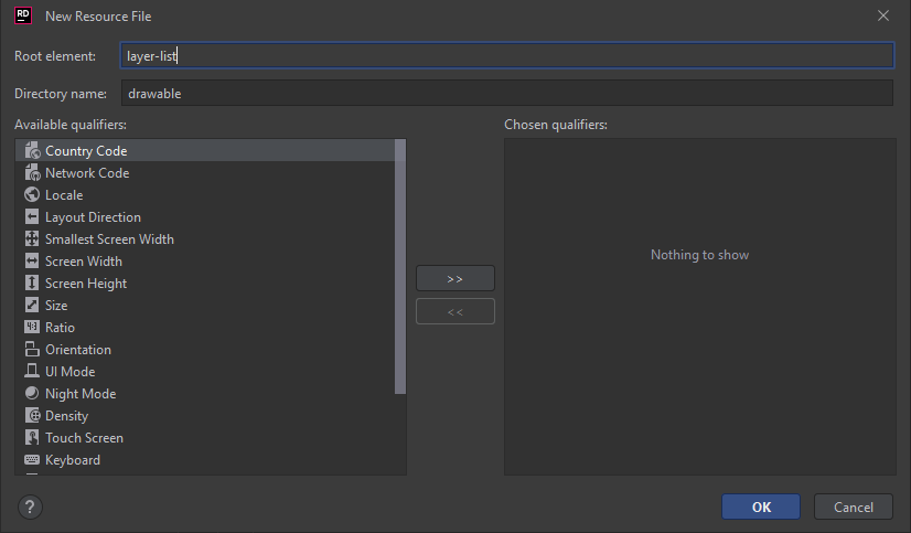
Custom Progress Drawable definition
<?xml version="1.0" encoding="utf-8"?>
<layer-list xmlns:android="http://schemas.android.com/apk/res/android">

    <item android:id="@+id/background">
        <shape android:layout_width="match_parent">
            <solid android:color="@color/robbie_card_grey"/>
            <corners android:radius="40px"/>
        </shape>
    </item>

    <item android:id="@+id/progress">
        <clip
                android:clipOrientation="vertical"
                android:gravity="bottom">
            <shape>
                <solid android:color="@color/robbie_in_progess_green"/>
                <corners android:radius="40px"/>
            </shape>
        </clip>
    </item>

</layer-list>
Let's define colors
<?xml version="1.0" encoding="utf-8"?>
<resources>
    <color name="colorPrimary">#2c3e50</color>
    <color name="colorPrimaryDark">#1B3147</color>
    <color name="colorAccent">#3498db</color>
    <color name="robbie_card_grey">#47FFFFFF</color>
    <color name="robbie_in_progress_green">#B6EC00</color>
</resources>
Glue everything together
Let's use our custom layout definition in activity_main.xml and add two buttons to control progress bar value
<?xml version="1.0" encoding="utf-8"?>
<LinearLayout
        android:orientation="vertical"
        xmlns:android="http://schemas.android.com/apk/res/android"
        android:layout_width="match_parent"
        android:layout_height="match_parent"
        android:gravity="center"
        android:background="@drawable/gradient_robbie">

    <include
            android:id="@+id/progress_bar"
            layout="@layout/vertical_progressbar"/>

    <Button
            android:layout_marginTop="20dp"
            android:id="@+id/button_add"
            android:layout_width="wrap_content"
            android:layout_height="wrap_content"
            android:text="Add"
            android:textColor="@color/robbie_white"
            android:textSize="20dp"/>


    <Button
            android:layout_marginTop="20dp"
            android:id="@+id/button_subtract"
            android:layout_width="wrap_content"
            android:layout_height="wrap_content"
            android:text="Subtract"
            android:textColor="@color/robbie_white"
            android:textSize="20dp"/>

</LinearLayout>
I've used gradient background gradient_robbie, you can define it by this code:
<?xml version="1.0" encoding="utf-8"?>
<shape xmlns:android="http://schemas.android.com/apk/res/android">
    <gradient
            android:type="linear"
            android:angle="0"
            android:startColor="#075466"
            android:endColor="#5b1344" />
</shape>
Driver! Move that bar!
Ok, we have everything defined but it's static. Let's move this progress bar a little bit.
Modify OnCreate method in MainActivity
public class MainActivity : AppCompatActivity
    {
        private Android.Widget.ProgressBar _progressBar;
        private Button _addButton;
        private Button _subtractButton;

        protected override void OnCreate(Bundle savedInstanceState)
        {
            base.OnCreate(savedInstanceState);
            // Set our view from the "main" layout resource
            SetContentView(Resource.Layout.activity_main);

            _progressBar = FindViewById<Android.Widget.ProgressBar>(Resource.Id.progressbar_current_order) ?? throw new NullReferenceException();
            _addButton = FindViewById<Button>(Resource.Id.button_add) ?? throw new NullReferenceException();
            _subtractButton = FindViewById<Button>(Resource.Id.button_subtract) ?? throw new NullReferenceException();

            _addButton.Click += (sender, args) =>
            {
                _progressBar.Progress += 10;
            };

            _subtractButton.Click += (sender, args) =>
            {
                _progressBar.Progress -= 10;
            };
        }
    }
Let's try it!
If you compile and deploy your code you'll notice that progress bar works but progress change is not animated :(
Let's add animations!
It's not that hard as it seems... just add the following method to MainActivity
        private void AnimateProgressBar(int newValue, int animationDurationInMs)
        {
            var animator = ValueAnimator.OfInt(_progressBar.Progress, newValue);
            animator.SetDuration(animationDurationInMs);
            animator.SetInterpolator(new DecelerateInterpolator());
            animator.Update += (sender, args) =>
            {
                _progressBar.Progress = (int)args.Animation.AnimatedValue;
            };
            animator.Start();
        }
Now modify event handlers for our two buttons
            _addButton.Click += (sender, args) =>
            {
                AnimateProgressBar(newValue: _progressBar.Progress + 10, animationDurationInMs: 250);
            };

            _subtractButton.Click += (sender, args) =>
            {
                AnimateProgressBar(newValue: _progressBar.Progress + -10, animationDurationInMs: 250);
            };
Success!
In my opinion it looks great! You can play with different Interpolators. You can find list of them here: Click!
Cheers! 🍸
Jeremi